NanoUX – Enhancing Gmail's Mobile Reply Experience for Reduced Anxiety
Feb 1, 2024
NanoUX, Design, Work
Gmail is probably the most used email service in the world with over 1 billion users. For most knowledge workers, email is a crucial part of our day. I personally receive at least 3 emails every day, and reply to at least 3 emails per week. But there's one friction point I encounter whenever I want to reply to an email on my phone - I prefer to do it on my computer instead. But why?
Context in UX Design
Why do I feel more comfortable replying to a WhatsApp message from my phone than replying to an important email from a client? Context. WhatsApp is primarily for my close personal relationships like friends and family. Replying to these messages on WhatsApp puts me in a relaxed mindset. However, an email from a client or investor feels different. Replying to these kinds of professional relationships requires more care, so emotions like fear and anxiety naturally arise.
When designing, it's vital to understand the context in which users will engage with your product. Will they be on the go? What kinds of relationships do they have (think social apps or email)? Where might they use your product and in what emotional state? Anticipating the situations and scenarios in which people use your product is key to crafting a delightful experience.
Designing for Anxiety
Anxiety is a feeling of worry, nervousness, or unease. We've all felt anxious at some point. For some, it can be triggered by situational factors. For others, it's an underlying emotion that's always lurking. These feelings influence how we behave when using digital products - like my discomfort replying to a client email on my phone because of the interface. I don't want to mess up an important message.
A core goal of design is to positively influence emotions. Let's analyze the Gmail mobile reply interface with a critical eye.
What they get right
Anticipating user intent

Tapping "reply" brings up the keyboard, anticipating my desire to start typing immediately.
Keeping context
Making the original message visible provides context.
UX Issues
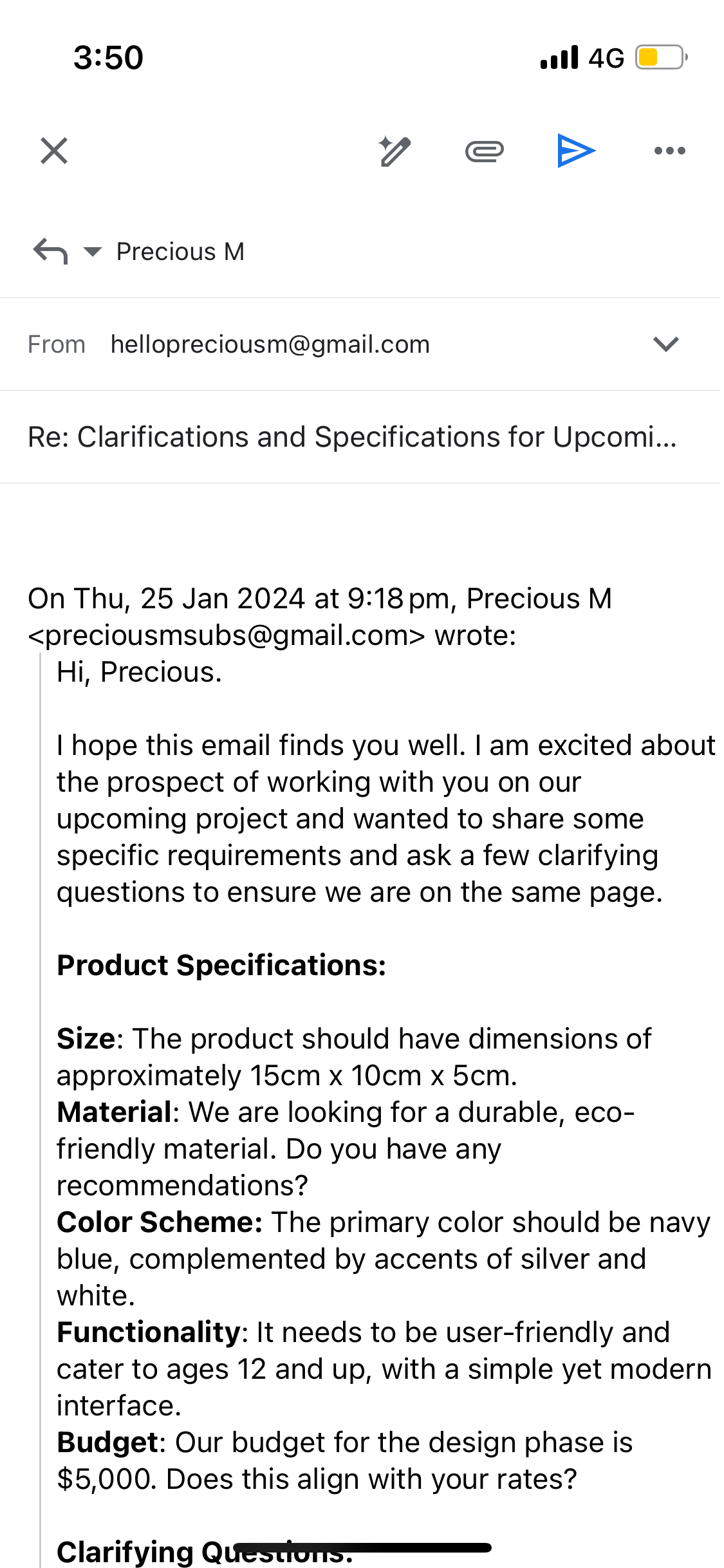
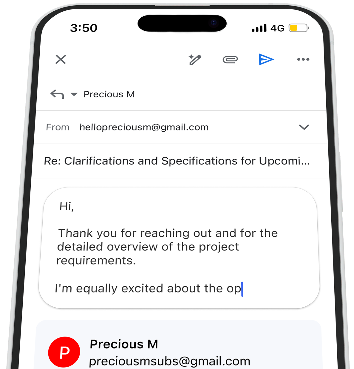
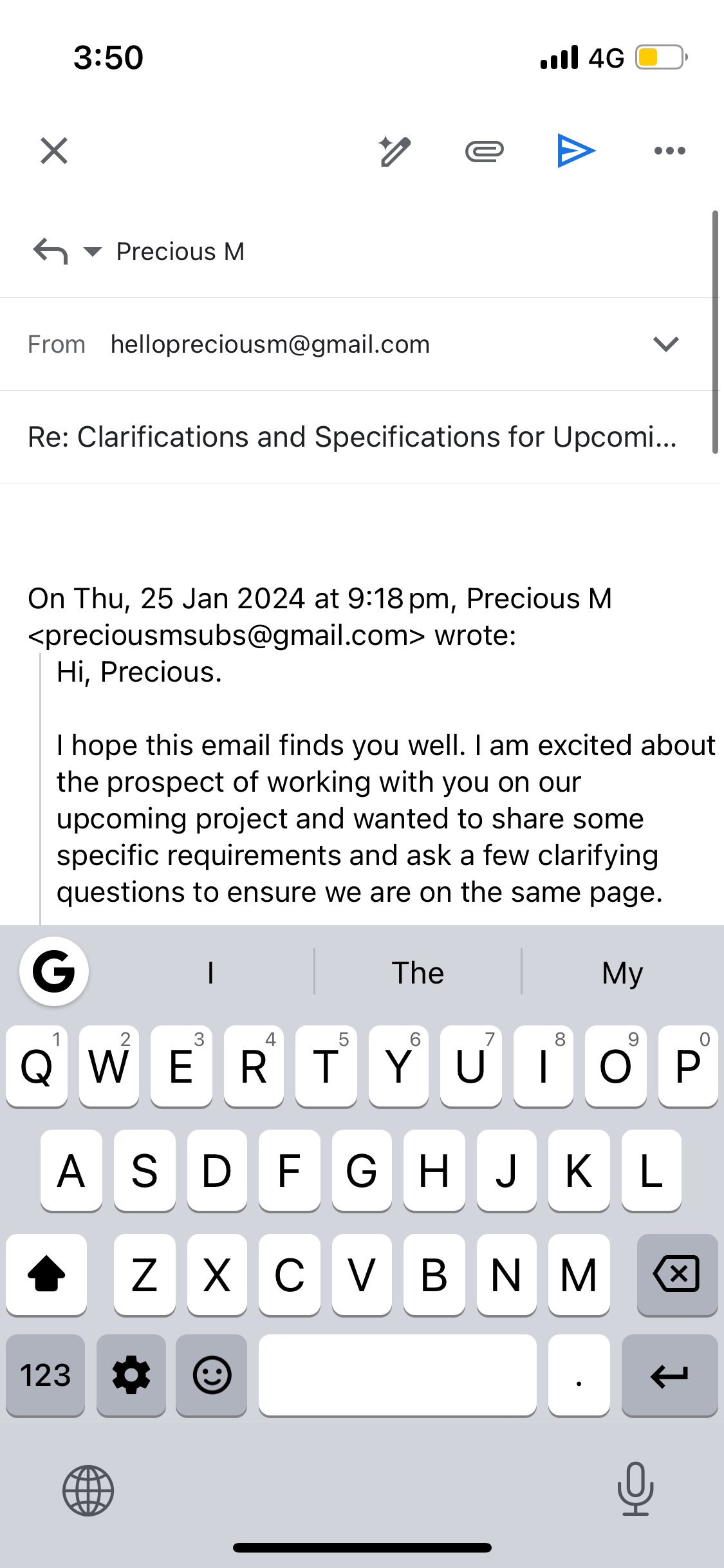
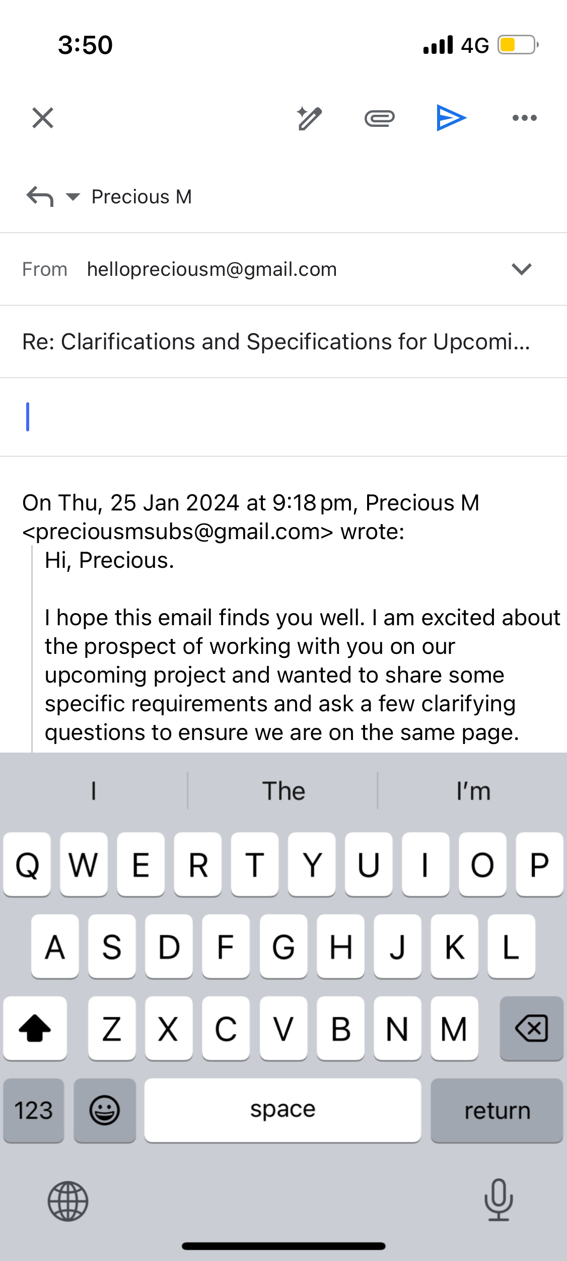
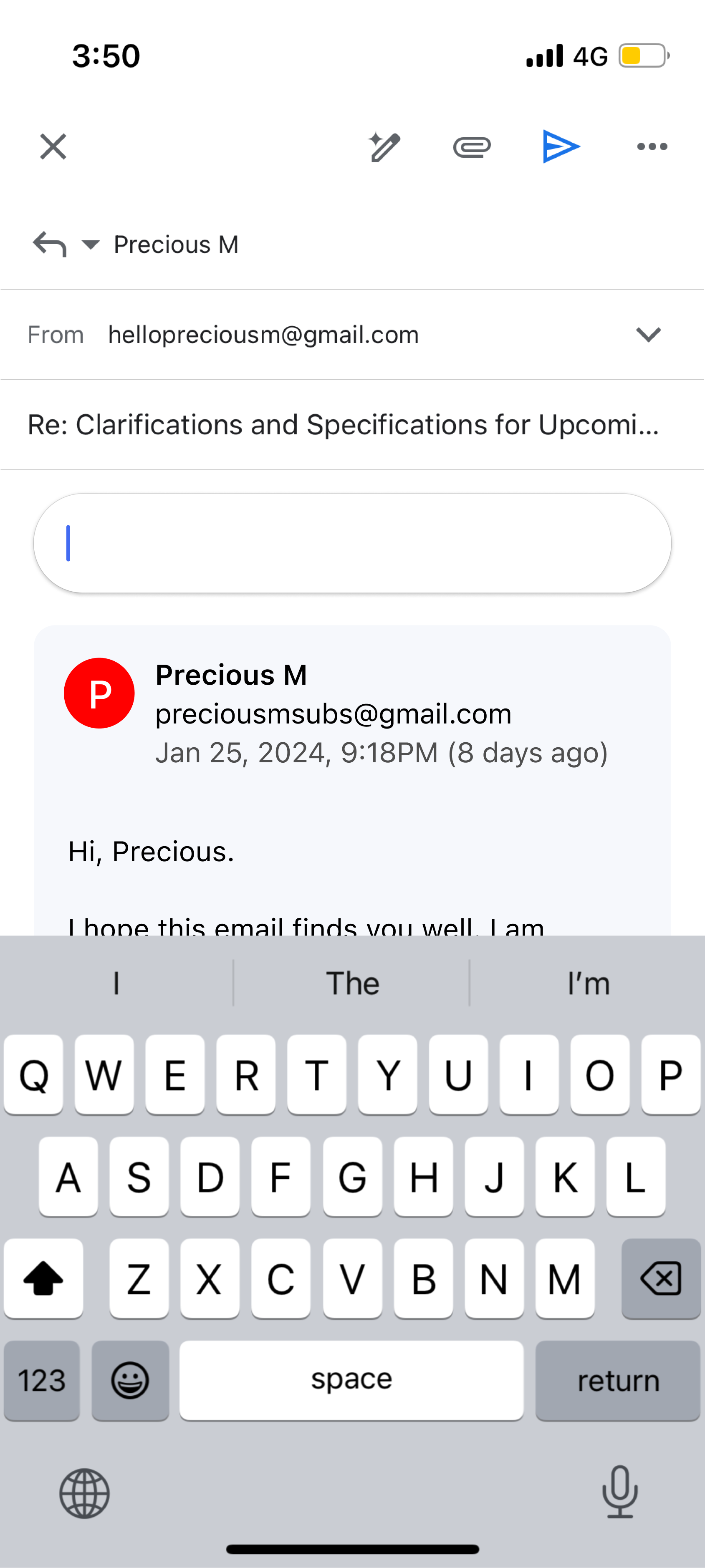
Cluttered first sight
The screen is a jumble of editable text when I tap "reply." Where should I start? Do I scroll down? I like seeing the original message, but why make it editable? Copy/paste works fine without that.
Unclear proximity
No visual separation between the original message and my new reply. Since they're so close together, I struggle to differentiate between the two. Gestalt principles say elements close together seem related, yet these are distinct.
Suggested Fixes
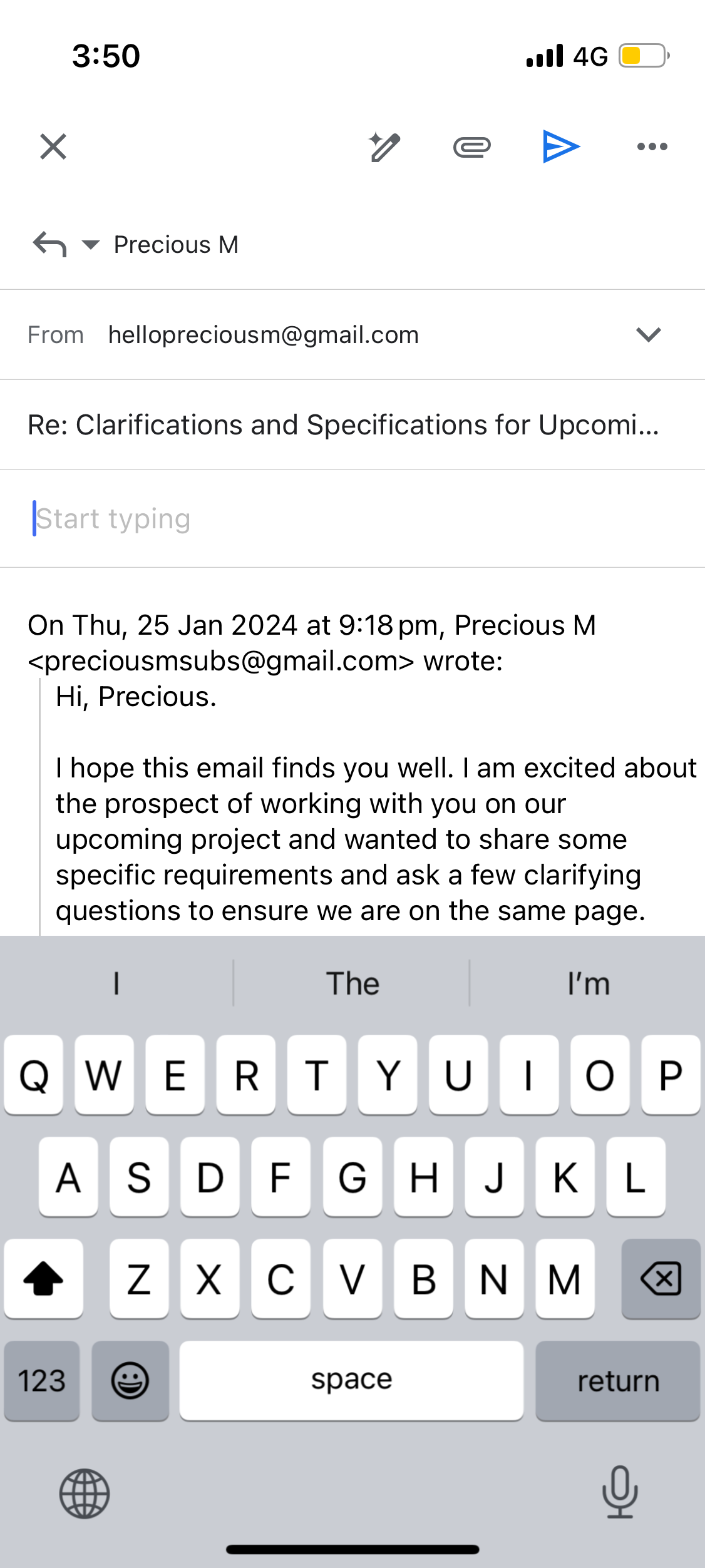
1. Add visual distinction between original and reply
Exploration 1
Here, I explored a small but impactful UI enhancement by adding a horizontal line between the reply section and the original message in email threads. Though subtle, this visual separator creates much needed space between the two blocks of text. The lightweight horizontal rule helps the reader's eye distinguish the original message from the reply. This seemingly nano improvement enhances scanability and comprehensibility
Exploration 2
In this design exploration, I drew inspiration from Gmail's desktop application by incorporating some of its design patterns such as the textbox with a box shadow to visually distinguish different blocks of content. Similar to Gmail on the web, I have added subtle background colors to separate the original message from the reply in email threads. This provides clearer visual hierarchy and improves scanability compared to walls of unbroken text.
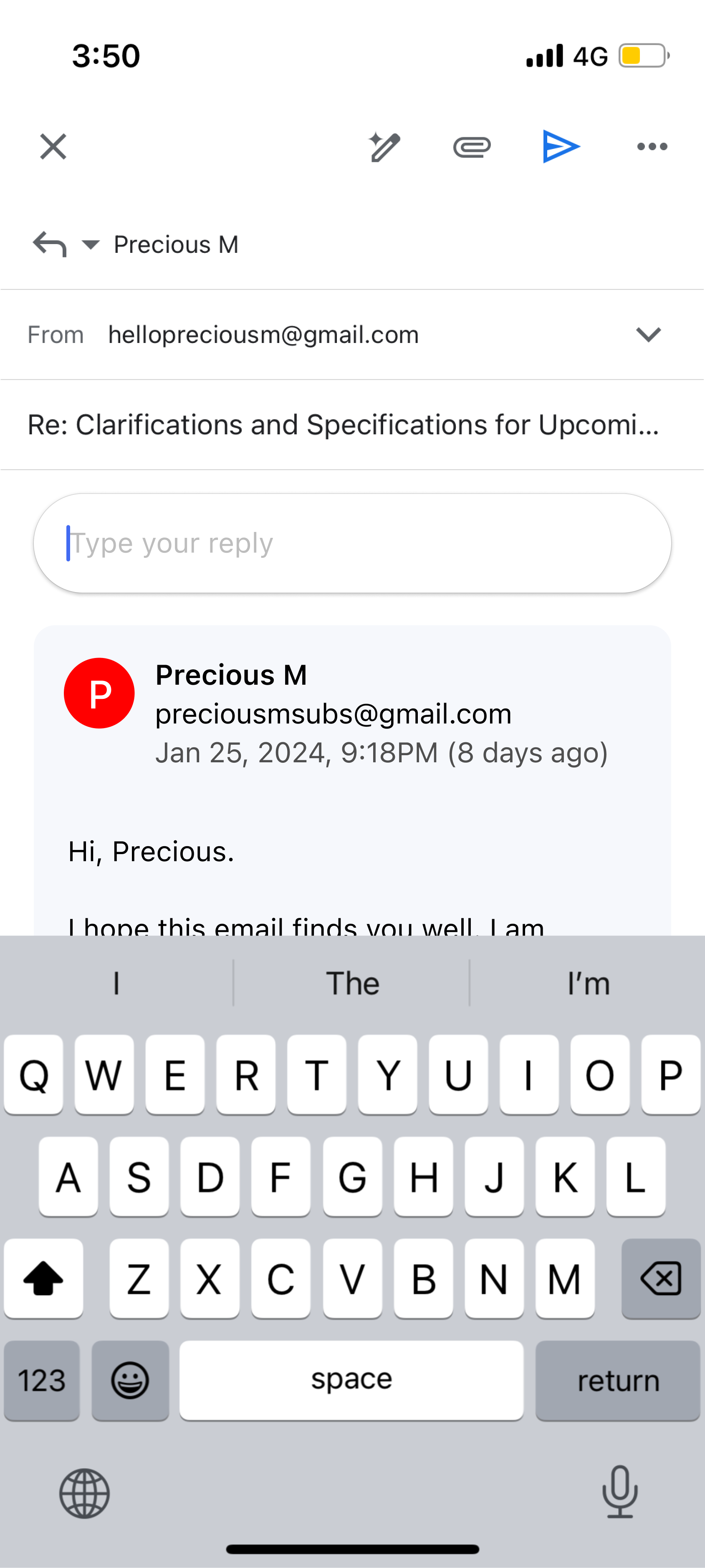
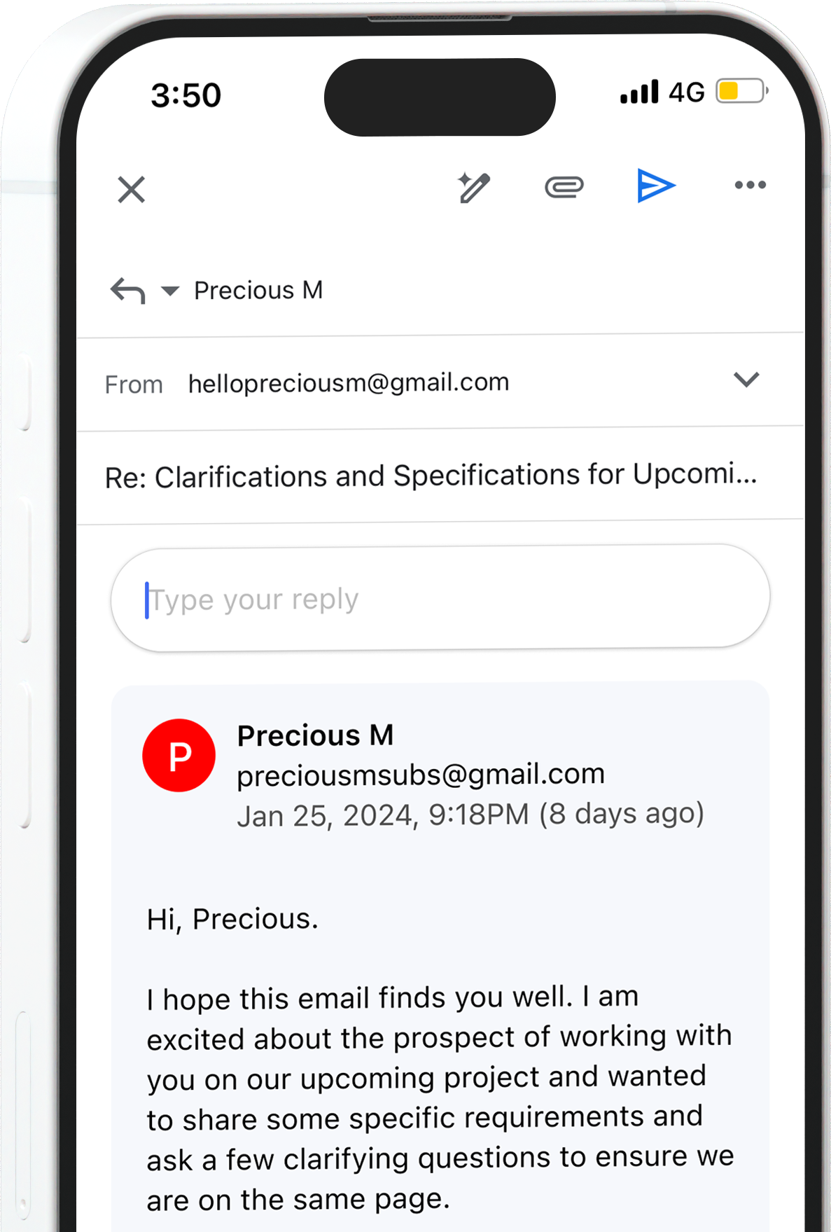
2. Guide the user - Add "Start typing" placeholder text in the input field.
Exploration 1
Exploration 2
Here, I explored a small but impactful UI enhancement by adding a horizontal line between the reply section and the original message in email threads. Though subtle, this visual separator creates much needed space between the two blocks of text. The lightweight horizontal rule helps the reader's eye distinguish the original message from the reply. This seemingly nano improvement enhances scanability and comprehensibility
Bringing it all together
Conclusion
Gmail's mobile reply interface has room for improvement, particularly regarding clutter and visual distinction.
Enhancing the mobile reply experience in Gmail can significantly reduce anxiety for users. By understanding the context in which users engage with a product and designing with consideration for the emotional state of users, designers can create a delightful experience.
In the next series of Nano UX, I'll be exploring a friction point I regularly encounter when discovering new music. Be sure to follow me on social media to stay updated as I analyze this experience and propose potential solutions.